


Taking fashion to the field: A ranking of Coppell jerseys
May 13, 2020
Imagine if players from every Coppell athletics team wore their jersey and walked down a runway for judges to score their style.
That would never happen. But that’s why I’m here to help.
Here we have all Coppell jerseys, and it’s time to rank them based on fashion. It’s as simple as that.
11. Track and field

I’m sorry. Nobody wants to hear their sport’s jersey is the lowest ranked in the school. But track and field, this is you. Let’s start with the fact there was some potential for creativity. I like that. However, the stripes were a dealbreaker alongside the ombré. It is not 2014. There is no need for round stripes and going from white to gray. This just makes me scrunch my nose. That’s all I have to say.
10. Football

This is like every other football jersey. Football jerseys, in general, are nothing exciting. Coppell has nice looking black jerseys, but that gray? It is no good. What I do like is that they really said all numbers or no numbers, because there are not one, not two, not three, but four of the same number plastered throughout the player’s jersey. We have them on the back, the front and baby ones on each shoulder. Football has really outdone themselves.
9. Lacrosse

This is as bland as football but a little bit better; there are stripes in the sleeves. The style here is as ordinary as it gets. There’s your number on the front with the team name above and your number on your back but just a tad bigger. For lacrosse, however, we have these nice stylist stripes added on. Lacrosse, way to step up your game from basic to kind of basic.
8. Soccer

This would have been ranked lower if it wasn’t for that really unique Coppell soccer logo in the top right corner. The originality, the variety in shapes – this was the make or break factor of the soccer jersey. Props to you guys for having on your own symbol. Girls, your jersey is sharp. But why is the ranking so low, you ask? It is the boys’ red jersey with the skinny black stripes. That was not a great choice. The font of the numbers are also uncomfortably robot-like. The whole jersey reminds me of a robot because the lines look like static. These soccer players are not in any way rusty, but robots are. Leave the robot style to the robots.
7. Tennis

The middle. I like the polo style shirt, I really do, but this has so much more potential. The polo for the boys team could have had something going for them, but they are plain. My biggest problem is that tennis wears any Coppell tennis shirt to a match. While the polo or tank top is probably ideal, I notice some players wear a T-shirt. I ranked this higher because there are two jerseys – the boys’ polo and the girls’ tank top – and those themselves are nice looking but have nothing on them. It’s just the middle.
6. Hockey

It may be a surprise this wasn’t with football and lacrosse because it seems just like those two, in terms of jersey style. However, hockey is different. The Coppell colors are all incorporated into the jersey, which is greatly appreciated. We have the base color red with black shoulders and white and black stripes near the end of the sleeve. The use of space for numbers and letters is also very well utilized. We have the player’s number on both arms and the back. The front has our school logo, screaming that Coppell is proud to be Coppell. Good job, hockey.
5. Swimming
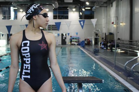
Now this may not be a jersey, but the elements of design used on the girls’ suits are impeccable. Let’s start with “Coppell” in big white letters that fall sideways on the left. What creates the words to be so charming is that it’s white, the opposite value of black, and the letters are in a serif typeface. Then there is the striking Coppell logo in the top right corner. The suit should be a part of a swimwear line.
4. Basketball
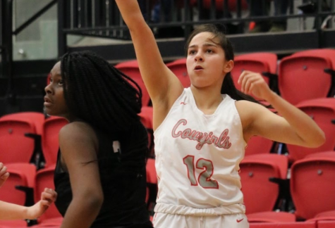
The cut of the top is what I would call the ideal tank top. It covers the entire upper body but still gives lots of room to move in. The font of “Cowgirls” is a pretty southern cursive on the girls’ jerseys; the boys’ font is not as appealing but still, that square “Coppell” front and center stands out from the crowd. Basketball’s jerseys are quite lovely.
3. Volleyball
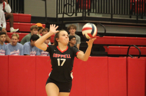
The sleek, fitted jersey is another fantastic look. Everything is perfectly centered, and see how the font isn’t so chunky? It’s one of the few that doesn’t have fat fonts. The black jersey shapes the players form with red and white, while the white jersey stays all one color. There’s not too much to say other than it just looks real good.
2. Golf

As we know from tennis, I love a good collar, and the golf jersey has got a very nice one. When I tell you these are shirts I would wear out in public, they are. The small details that show Coppell fans who they are rooting for is placed in the perfect spot: a star in the right corner. Now, I know this is about the jersey, but what the girls wear is amazing. We love a peppy look with a collared shirt and a sporty-chic skirt. This jersey is simple yet elegant in its own way, making golf a close second.
1.Baseball and Softball
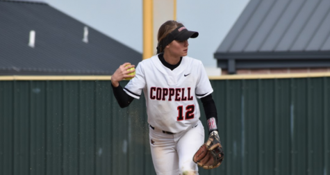
First of all, the layout of words and numbers has been uniquely placed with “Coppell” being centered across the chest and the number not directly under or even to the left side, but yes, the right. It gives it a different look, rather than if it were to be read a more normal way. The font of Coppell is nicely done. I love that this is one of the few jerseys that doesn’t have huge bulky letters. The jersey also has a very interesting collar. Softball’s is round and seems to overlap in the center, while baseball is more of a V-neck style. The faint stripes are another part of this jersey I love so much. Overall, baseball and softball win, 11/10. These jerseys are immaculate.
Follow Lilly (@lilgormet) and @SidekickSports on Twitter.


Drew • May 14, 2020 at 1:02 am
Interesting article
Samantha Freeman • May 13, 2020 at 5:01 pm
Only you could write this story Lilly Gorman. This story is immaculate.
Anthony Cesario • May 13, 2020 at 3:39 pm
I love this