By Corrina Taylor
Staff Writer
Day by day the technology team of Coppell ISD pondered ways to create a website that was fully manageable and easy to use for everyone. For a year their days consisted of contemplating various color schemes, new features that may be needed and a way to pull it all together somehow.
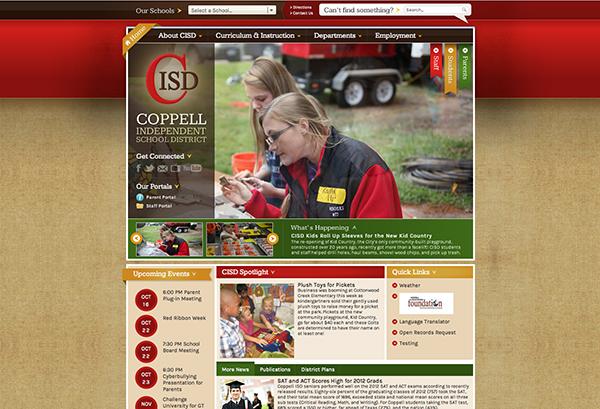
Today, their work has finally paid off in the revealing of the updated CISD website.
“The new site has some great new features; it has an updated look and design, so hopefully it looks new and exciting and represents the school district well,” CISD webmaster Bria Jones said. “We have a new mobile friendly feature so if someone views the website on their mobile phone it’s not just a rendering of the current website; it actually is icons they get to press to get selected information.”
On the CHS page, the background color scheme of dark and light red along with a portion of tan is a nice contrast against the grey tabs under the Coppell High School banner. The School Spotlight section has been enlarged to give the viewer a better look at the photographs of CHS students. These are just some of the many features reformed; overall the website has been updated as the site steps into the future of technology.
With the school heading into the more technical aspect of education, it was time that its website reflected the school’s mission. This is why after six years the website has been restructured to fit a more contemporary look as well as include new aspects to make it more appealing for students fitting into the busy 21st century lifestyle.
The process of creating the site started last October after the content managing system developed a new upgraded system called Centricity 2. Once this update was available the technology team consisting of CISD director of communications and public relations Tamerah Ringo, executive director of technology Chad Branum, former webmaster Tony Trejo and Jones set to work. They looked at what the new site would need as well as certain features they thought would be essential to add.
Next they had the decision of choosing the design and the colors that would fit their new website and the look they were going for, once all of this was completed it was implemented and the content was updated. With everything that was added to the site, from the new software, to the mobile accessibility the team used up the budget of $22,000.

“I’m sure a lot of work went into the site. The process of making an efficient and effective website is a challenge, even on just the graphical design side,” AP computer science senior Matthew Johnson said. “The code itself is quite large, since they have put in the ability for the website to scale for any screen size.”
Convenience was one of the main goals of the technology team putting the site together; it is also the strong point of the new site. With the calendar, school hours (which shows the lunch schedule as well) and bell schedule on the left tab it makes it more expedient to find the information that is needed quickly. Viewers can be properly updated on what is happening on campus in the section underneath the spotlight.
In the principal’s section there is room for viewers to quickly read about any changes in the school or any impending events. A tab next to it shows another way to easily access the campus news by promoting the various media outlets used on campus such as The Sidekick and KCBY. To the right the final sidebar consists of a scrolling announcements bar that keeps people properly updated on school events, contact information for the school, and quick links to important sites.
The top of the screen has two separate tab bars, the top one consisting of a much easier way to access portal and the lunch menus (which was not posted on the original site). This makes it easier for students in a hurry needing to check their grades or figure out what they are getting for lunch. Below the CHS banner is the second tab with the general tabs that were seen on the last site.
“The new site you can get to things easier, it isn’t too text heavy and it is visually appealing,” Ringo said. “We put a lot of effort into it [the site] so that we could appeal to parents ant the community, we wanted a site that would provide news and information about the schools and district.”
The district sites, as well as all of the separate school sites, have made it easier for the community to become more involved in the school district. The announcements on every page have been made visibly noticeable on a quick glance in order to relay their school’s upcoming events for those who may not already know about it.
Today is the official launch of the new site, much to the relief of the people involved in the creation of this new site. There is sure to be some confusion when people first access the recently vamped site – this is expected when a site is updated. Overall the team has high hopes for the success and popularity of the new site.
“I love it [the new site]; I’m proud of all the work of our team, we worked really well with Chad Branum and our webmaster Bria Jones along with the rest of the team,” Ringo said “It was a yearlong process and in the end it was worth it and the time was well spent.”


