
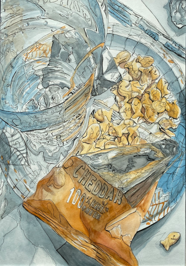
Freshman Spryidoula Angeli advanced to state and won a state medal for her work “Too Many Goldfish?” in the 2023 Visual Arts Scholastic Event. VASE is a competition held every year in Texas to recognize distinguished artists across regions.
Spryidoula Angeli
Scourging through her kitchen cabinets, freshman Spyridoula Angeli was waiting for a glimmer of inspiration for her latest piece. She happened upon a bag of Goldfish and several water bottles and, even if others viewed it as junk or trash, Angeli knew she had found the subject of her next work. That “trash” formed the piece “Too Many Goldfish” with which she competed in the regional VASE competition and was awarded a state medal.
How would you describe the State VASE process?
I thought it would be stressful but when I got there, you had to wait outside for a while. By the time I actually walked in to do the interview, it was not stressful and the people were really nice. We talked about art so it was really cool. For VASE, we went to an actual place so that they actually interviewed us and we didn’t just read off the thing. We got to see more artwork so that was a really good experience. For junior VASE, we didn’t get to do that, we just got the results.
What does your artistic process look like?
My art process is kind of chaotic. I start off with an idea and then I build off of the idea – but it kind of gets me somewhere, sometimes nowhere or sometimes I totally change it. I never really know where it’s going to end up. Finding a good idea and actually trying hard to get it how you want it on the artwork. You have to have a good idea and a clear image and then you can change it up if you want.
What are your specific stylistic choices for this piece?
I chose blue and orange, which are complementary, because blue is already in the composition. It was already blue and orange because of the orange of the goldfish and the blue of the rest of the art. I chose to take away all the other colors to minimize it to two colors. Watercolor is a very good choice to go with because it’s really easy to use to mix together and make it seem cohesive. I chose it mostly because I feel like it could make it a different filter on the artwork and make it more unique than just a photograph.
What was an unexpected obstacle when creating this piece?
Smearing of the ink that sometimes happens and it’s much harder to do whenever you’re working on a large surface and it dries as you go but it’s still something you had to deal with. One that I had to try to actively stop was the paper warping, ripping or losing quality as you added more watercolor. In order for that not to happen, I had to wait for it to dry and add more layers afterwards or work on other spots so that it could dry to fix it.
Follow Manasa (@Manasa_Mohan_7) and @CHSCampusNews on Twitter